What is the difference between RGB and CMYK?
Dean Cook • Oct 16, 2023

When creating artwork, what is the difference between RGB and CMYK, why does it matter, and what colour mode is better? Dean Cook explains

RGB and CMYK are the two most common colour models in graphic design. RGB stands for red, green, and blue, the primary colours for digital displays, such as computer monitors, TVs, and smartphones. CMYK stands for cyan, magenta, yellow, and black, the primary colours used for printing. The main difference between RGB and CMYK is the way colours are mixed. 

RGB – mixing light. RGB uses an additive colour model, meaning that colours are created by adding light. For example, when you combine red, green, and blue light, you get white light. RGB also offers a superior colour range (gamut), which consists of three HSB components: Hue (colour), Saturation (intensity) and Brightness (brilliance).

RGB – MIXING LIGHT

RGB uses an additive colour model, meaning that colours are created by adding light. For example, when you combine red, green, and blue light, you get white light. RGB also offers a superior colour range (gamut). Each RGB colour has values ranging from 0 to 255. In short, this translates into 16,777,216 possible colours.

CMYK – mixing paint. CMYK uses a subtractive colour model, meaning that colours are created with light subtracted. For example, when you mix cyan, magenta, and yellow paint together, you get black paint. The CMYK colour gamut is smaller than RGB, which is why, when colours convert from RGB to CMYK, you see many colour differences occur.

CMYK – MIXING PAINT

CMYK uses a subtractive colour model, meaning that colours are created with light subtracted. For example, when you mix cyan, magenta, and yellow paint together, you get black paint. The CMYK colour gamut is smaller than RGB, which is why, when colours convert from RGB to CMYK, you see many colour differences occur.

Why is black 'K' in CMYK and not CYMB?

Black is referred to as 'K' for Key, Key Colour, or Key Plate – a vital colour with full-colour printing, but also 'B' is too ambiguous as it could stand for blue (as found in RGB), brown or beige.


Colours misbehaving?

In today's artwork world, using the colour mode of the output intent is always good practice. However, if you produce artwork for both screen and print, which method is better and why?

If artwork is to be printed, RGB colours must be converted to CMYK at some point in the process. If left to computer software to convert colours, whether when PDF files are exported or relying on the printer's prepress system to convert, managing colours within your artwork would be outside your control. Also, the printer will not see how you see colours on your screen. As a result, you will likely encounter vibrant colours that will dull; oranges appear brown, bright greens darken, or there is a shift in colour, such as royal blues printing with a greater hint of purple. In short, results can be disappointing.

We would never solely rely on any pre-press process to blindly convert RGB colours. Instead, we prepare images and artwork as the print output device requires, minimising any colour changes that could occur later in the process; we are in control.


Every image a client provides receives colour treatment, profile management, balancing, and enhancement to ensure images replicate as we intend. We do most of the work in RGB before converting to CMYK and making further adjustments if required before saving and ready for placement. 


Compare this to other providers who aim to save time, simply drag-and-drop unmanaged RGB images, resulting in poor colour and/or dark (over-saturated) images. Here's a typical example of what we frequently hear.


What do designers prefer?

Designers offer valid opinions as to why working with RGB is better; others CMYK, and those that advocate the latter are likely to have gained more insightful experience working with commercial printers — as we have, showing greater consideration with the technicalities of colour and how it can behave on specific substrates (materials used to print on). We consider possible outcomes when constructing artwork regardless of whether it appears on screen or in print.

A simple trick to help gain better control and consistency with colour is to convert RGB images to the smaller CMYK colour gamut, make colour adjustments, and then change the colour mode back to RGB again. Because colours in the wider RGB colour gamut now sit within the CMYK gamut, what you see on screen is more likely to give you more confidence in how the colour will look when printed.

How to maintain better RGB / CMYK colour consistency

A simple trick to help gain better control and consistency with colour is to convert RGB images to the smaller CMYK colour gamut, make colour adjustments, and then change the colour mode back to RGB again. Because colours in the wider RGB colour gamut now sit within the CMYK gamut, what you see on screen is more likely to give you more confidence in how the colour will look when printed.

An often-overlooked problem

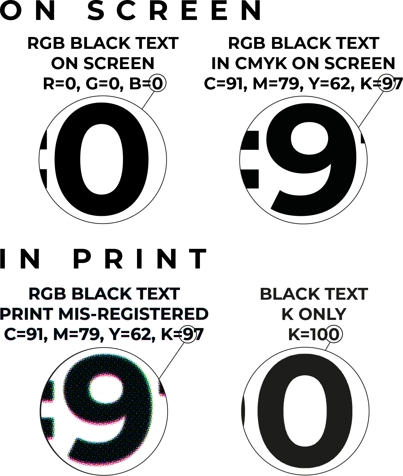
With black text you read on screen, RGB colour values are all set to zero – nothing. Converting nothing from RGB to CMYK achieves the opposite, adding a lot of colour to each channel to achieve a similar black. As RGB, black is 0% Red, 0% Blue, 0% Green, but as CMYK, it's likely to be 91% Cyan, 79% Magenta, 62% Yellow and 97% Black. These heavy colour values pose a significant problem with paragraphs of black copy, for example.


As colour values are now applied to all four C, M, Y and K channels, it greatly increases the chances that fine text will look blurry if any of the four CMYK colours do not precisely register (ink overlaying on top of one another). It's a typical printer's nightmare. 


The only way to achieve precise definition with black text is to apply the text to the 'K' key colour, which means additional production work is required to correct or, better still, work with CMYK from the outset, keeping bodies of text to the black-only 'K' channel.


CMYK for digital publications?

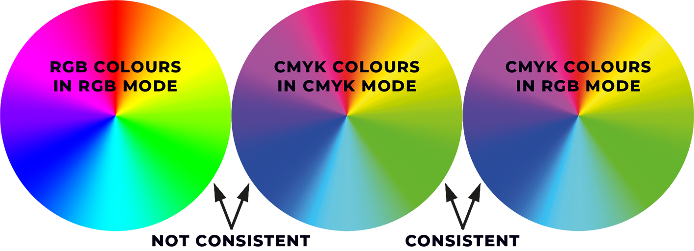
Yes, well, only as long the artwork is being constructed simply because we can easily convert CMYK-based artwork to RGB, ensuring better consistency with colour without incurring any technical issues. It also means all pages are print-ready for any digital-print or litho-print CMYK process if ever the client requires, at any time in the future, swiftly supplying colour-accurate artwork for print in minutes without the need to rework or revisit assets.


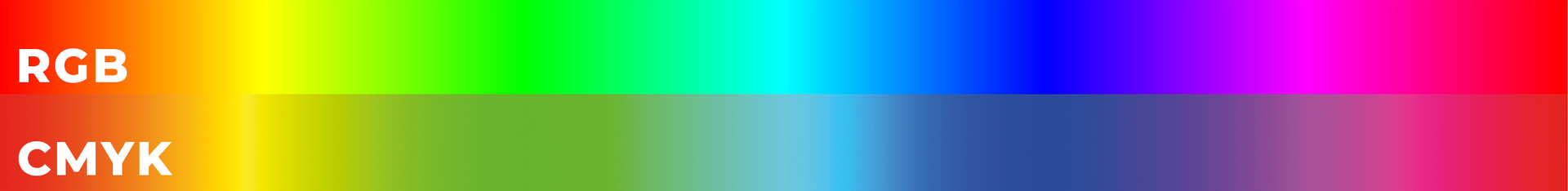
If you're looking for a short answer, CMYK covers all possible output processes while ensuring colour consistency is maintained.

The post 'What is the difference between RGB and CMYK?' appeared first on  The Magazine Production Company.
Click here to go back to the main articles page.

Share this content!

Read more of our articles

a magazine designer preparing an advertiser's artwork
by Dean Cook 16 Apr, 2024
As an independent publisher, your vision is the driving force behind your magazine. But translating that vision into a visually stunning, reader-engaging publication requires a skilled and experienced magazine designer or a magazine production artist, as many often refer to the role.
by Dean Cook 05 Apr, 2024
Are you an independent publisher searching for a magazine designer to bring your vision to life? Look no further than The Magazine Production Company ( www.magazineproduction.com )!
by Dean Cook 06 Mar, 2024
So, you're ready to embark on the exciting journey of creating your own magazine! But amidst the flurry of brainstorming content and captivating visuals, a crucial question arises: 'What software do I need to create a magazine?'
by Dean Cook 02 Feb, 2024
So you have a fantastic magazine idea! It is filled with captivating stories, stunning visuals, and a message that will resonate with your target audience. You turn on your computer, fire up a design program, and think, "Piece of cake!" But hold on there, aspiring publisher. Creating a professional, print-ready magazine goes far beyond simply arranging text and images on a page.
Load more articles
Share by: