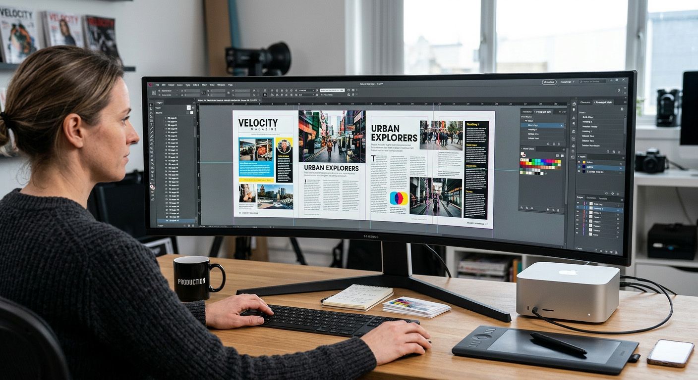

When advertisers supply artwork for a magazine, choosing the right file format can make the difference between a crisp, professional campaign and a blurred, pixelated disappointment. Drawing on prepress experience at The Magazine Production Company, Dean Cook explores why print-ready PDFs remain the gold standard for both physical publications and digital editions — and why partnering with a professional designer is the smartest investment a business can make.
If your business has routinely supplied advertising artwork as a JPEG file for years, you are certainly not alone. Many advertisers fall into a comfortable routine, saving ads as quick image files because it feels straightforward and familiar. However, when those adverts land on a physical magazine page or inside an online digital edition, the technical limitations of a JPG versus the gold standard of a PDF become starkly apparent.
As The Magazine Production Company, having processed thousands of publication pages, we note that 90% of the adverts we receive are properly supplied as compliant PDF files.
This guide explores why PDF remains the undisputed industry standard across both print and digital editions, clarifies the critical distinction between PPI and DPI (including the underlying math of how pixels become ink dots), and examines why transitioning away from JPGs — and partnering with a professional designer — offers businesses far greater strategic value than simply securing a compliant file format.
1. The PPI vs. DPI Misconception: Clearing Up Resolution Terminology & The Math
One of the most persistent technical misconceptions in graphic arts is the interchangeable use of PPI and DPI. Even experienced designers and advertising sales teams frequently ask for "300 DPI adverts," when what they actually require is 300 PPI.
- PPI (Pixels Per Inch): Relates to input and digital image files (raster graphics). It measures how many pixels are packed into every linear inch of a digital image or rasterised file view. For print publishing, artwork requires a density of 300 PPI at actual reproduction size to ensure razor-sharp clarity without pixelation.
- DPI (Dots Per Inch): Relates strictly to hardware output and physical printing press mechanics. It measures the physical ink droplets or laser dots a printer or platesetter deposits onto paper per linear inch (often ranging from 1200 to 2400+ DPI).
The Math: How Pixels Translate to Press Dots
To understand why these two metrics coexist without contradicting each other, it helps to look at the underlying math of the printing press workflow.
Every single pixel in a 300 PPI digital image carries a specific CMYK colour value (a combination of Cyan, Magenta, Yellow, and Black percentages). However, a commercial printing press cannot print variable shades of ink directly; it prints microscopic solid dots of ink using a halftone screen. By multiplying each coloured pixel by four dots (one dot for each C, M, Y, K colour) it gives you the 1200DPI (Dots Per Inch) which is the output required for a crisp, high-quality result, and is typically the resolution of a colour printer.
When specifying artwork for a magazine layout, you are setting pixel density (PPI), whereas the commercial printing press handles the physical ink dot formation (DPI).
2. The Anatomy of Print & Digital: Why PDF is the Ultimate Standard
Unlike web display banners where screen resolution (72 PPI) and RGB colour modes dominate, print demands uncompromising precision. However, modern publications are increasingly distributed as dual-format media — appearing in print alongside online digital editions and flipbooks. The Portable Document Format (PDF) — specifically PDF/X standards — was engineered precisely for these multi-channel workflows.
A professional print-ready and digitally compliant PDF embeds crucial elements into a single package:
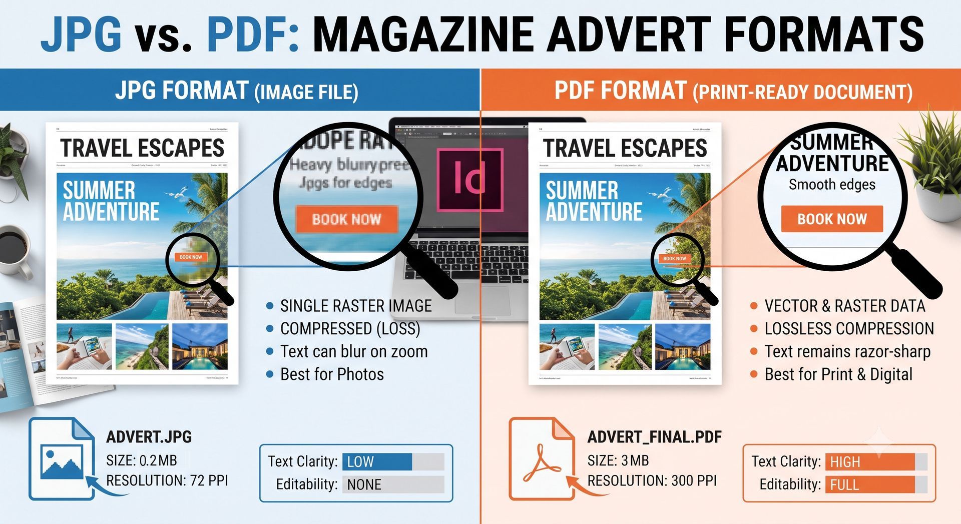
- Vector Graphics & Typefaces: Fonts and vector lines are stored mathematically, meaning they remain infinitely crisp and sharp regardless of how close you zoom or how high the printing press resolution is.
- Bleed & Crop Marks: PDFs cleanly accommodate printer bleed (extra artwork area past the trim line) and crop marks, ensuring zero unprinted white edges when the publication is trimmed.
- CMYK Colour Integrity: Commercial presses print using Cyan, Magenta, Yellow, and Key (Black) inks. PDFs maintain exact CMYK colour profiles, preventing unexpected colour shifts.
The Digital Publication Advantage: Active Hyperlinks
Beyond traditional press considerations, PDF is the superior format for online digital editions. When an advertiser includes a website address or an email address in a PDF advert, online digital publication platforms and PDF viewers can automatically recognise and convert website URLs and email addresses into live, clickable hyperlinks.
By contrast, an image-based JPG flattens all text into static raster pixels. Digital publishing software cannot read pixels as live text, meaning web addresses and email links are not converted. Readers cannot click through to the advertiser’s landing page, drastically reducing conversion rates and ROI from digital editions.
3. The JPG Trap: Resolution Loss and RGB Colour Blur
JPEGs are raster (pixel-based) image formats optimised for web compression. When an advertiser submits a high-impact advert as a JPG, several critical technical issues arise.
The Resolution and Compression Dilemma
JPGs use lossy compression to keep file sizes small. Every time a JPG is saved or resized, compression artifacts degrade the visual fidelity. When scaled up to fit a physical magazine page (requiring 300 PPI at actual size), a web-sourced JPG pixelates, looking blurry, jagged, and unprofessional.
The RGB Black Text Crisis
One of the most insidious technical flaws in using JPG adverts involves colour spaces. Standard office and web imagery is created in RGB (Red, Green, Blue) colour. When an RGB file contains rich black or composite black text (made of C, M, Y, and K values), the printing press lays down all four ink plates simultaneously.
Because paper moves slightly during high-speed printing press runs, microscopic misregistration occurs between the plates. In a JPG, this causes black text to display an irritating colour fringe or blur. Conversely, a professional CMYK PDF handles pure black text as a single K plate (100% K (Black) with zero Cyan, Magenta, or Yellow), ensuring the text is printed in a single crisp pass and remains crystal clear.
4. Comparison: JPG vs. PDF for Magazine & Newspaper Adverts
| Feature / Metric | JPG / JPEG Advert | PDF (Print & Digital Standard) |
|---|---|---|
| Primary Use Case | Web photography, online banners, social media. | Professional prepress, print magazines, and online digital editions. |
| Text Clarity & Edges | Rasterised pixels; prone to blurring and compression artifacts. | Vector-based crisp typography; razor-sharp edges at any zoom. |
| Colour Accuracy | Primarily RGB; requires conversion, risking dull or shifted colours. | Native CMYK support; exact colour matching via embedded profiles. |
| Black Text Rendering | Risks rich/composite black blurring due to plate misregistration. | Single K-plate black text; always crystal clear and sharp. |
| Digital Interactivity | Dead text; URLs and emails cannot be clicked (raster pixels). | Live text; online publishing platforms auto-convert URLs and emails into hyperlinks. |
| Resolution Metric | Often low web-resolution (72 PPI); degrades when scaled. | True print-ready resolution (300 PPI) with scalable vector fonts. |
5. Beyond File Formats: The Multifold Benefits of Partnering with a Professional Designer
While many companies default to supplying a quick JPG because internal marketing teams are stretched thin or lack dedicated graphic design software, recognising these limitations highlights why collaborating with an external professional designer pays dividends far beyond simply delivering a compliant PDF.
- Strategic Brand Consistency: A professional designer does more than drop text onto a page; they safeguard your visual identity. They ensure that corporate colour palettes (Pantone or exact CMYK builds), brand typography, and visual hierarchies remain immaculate across every campaign, reinforcing customer trust.
- Elevated Commercial Impact: First impressions matter immensely in print. An advert crafted by an experienced designer utilises professional layout principles, white space, and visual flow to guide the reader's eye directly to the call-to-action, vastly improving engagement compared to a hurried DIY effort.
- Resource Efficiency & Peace of Mind: Outsourcing artwork frees up an internal team to focus on their core business operations. Instead of grappling with bleed requirements, total area coverage (TAC), or colour profiles, companies can delegate the technical heavy lifting to a specialist who guarantees the file will pass prepress inspection first time — eliminating frustrating delays and last-minute proof corrections.
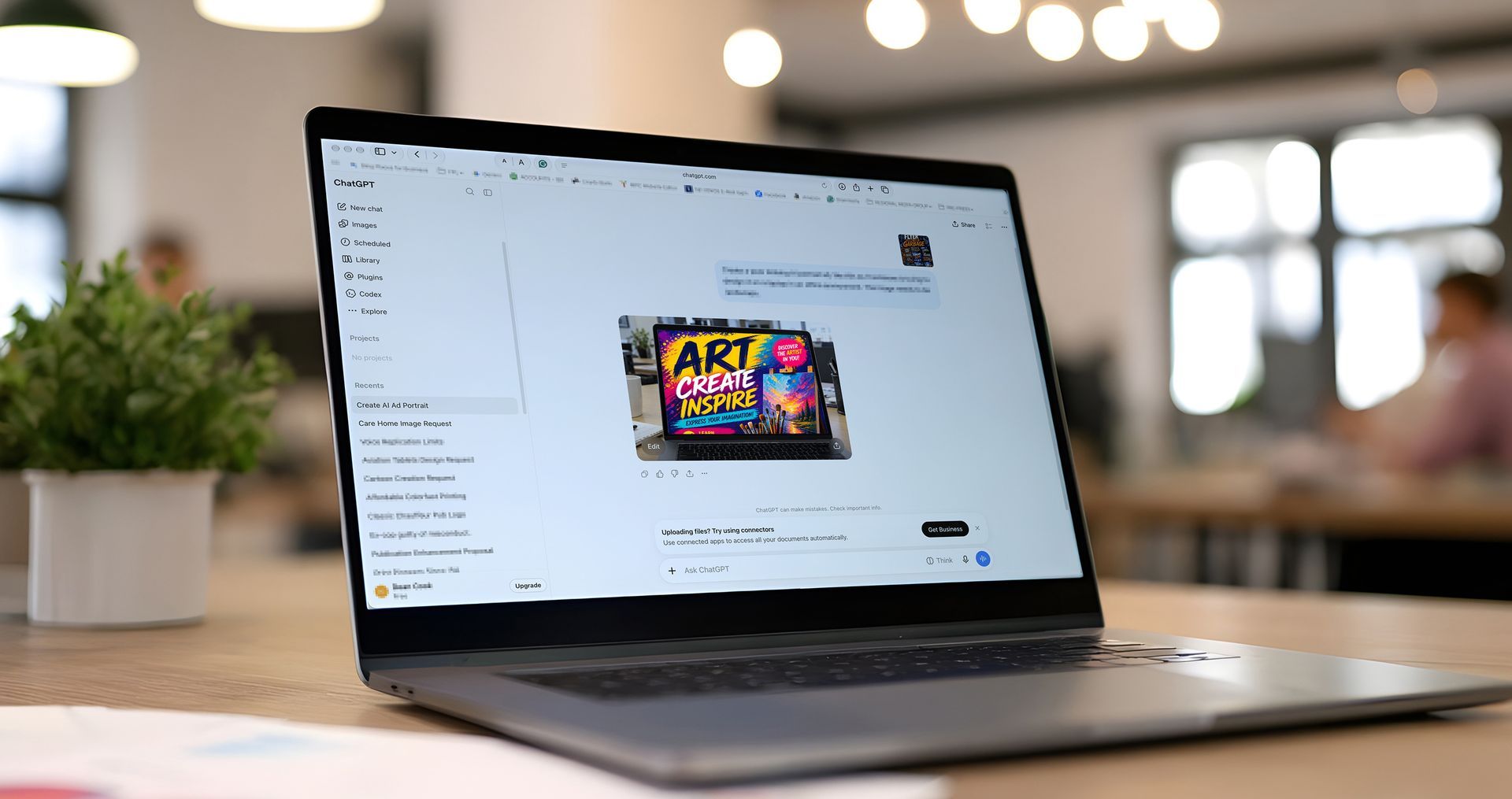
By all means use AI as a sounding board for ideas, but use an experienced designer to produce it properly, who can deliver it to the necessary technical standards for the intended output while maintaining your brand guidelines.
Publisher Tip: Publishers can use this guide as a direct educational resource to share with advertisers who submit substandard JPG artwork, dead web links, or confuse PPI with DPI. Providing a clear link to this standard helps elevate advertiser success, streamline workflow, and enhance the overall reading experience.
The post 'JPG vs. PDF Adverts: Print Quality, Digital Interactivity & Resolution' appeared first on
The Magazine Production Company.
Click here to go back to the main articles page.
Share this content!
Read more of our articles